Sunday, 29 August 2010

BLOCK 9

Block 9 was just a small section at this years Glastonbury Festival but also one of the most architecturally impressive areas I’ve ever seen constructed for entertainment.

There were many impressive structures in this area hosting late night clubs for the hardcore but the pieces you couldn't miss were the make shift buildings posing as true traffic disasters and half derelict one of which doubled as a performance stage. These were created with no less than the impressive finesse you would see at Universal Studios.


This area was like stepping into a real city of doom and with the festival atmosphere helping to drive the energy of the space it was not for the faint hearted.

(Block 9)


LSD

LSD (London Street Art-Design) is an online street art magazine. This is another example of great content with disappointing presentation. Although I am glad to see as the issues have rolled out there is some clear development in the page presentation.

Issue No.1 "No Permission No Control" is filled with reams of interesting information on street art both globally as well as from London but its presentation leaves something to be desired. The overuse of the stencil font and the backdrop imagery placed behind each page leave some almost illegible.

Flicking forward to Issue No.4 "Unauthorised Heroes" you can see how some of the backdrop design and page layouts have been tamed and are looking more professional in the most part. They've also improved the way you navigate through the magazine making it easier to get an overall impression of style.


LSD has now set up a blog so if you like your street art watch this space.


Saturday, 28 August 2010

INVADER

Invader is a French street artist on a mission. Working in many cities across the globe he's the instigator of one of the largest community art projects ever produced based on the game "Space Invaders".

Since 1998 Invader has done just that invading over 30 cities; you'll find the tiled pixilated images from the memorable retro game of the 70's. Inviting local communities to help plant his work as well as other projects he really is trying to inspire a new generation of artist, adding a small piece of visual magic locally which you know is appreciated and shared globally should give you a stronger sense of belonging with global community.


Still, all the fun element aside it was a little surprising to see just how much Invader could capitalize on his concept through the sale of over priced D.I.Y kits and map books as well as the usual clothing and figurine merchandise we're told we really want.

That said as long as you know where to look and you're a little lucky you'll never have to spend a penny...

Invaders In my home town Manchester, UK.

A couple of Invaders I came across in New York, USA.


KINGDOM OF FEAR


Hunter S. Thompson (Jul 1937-Feb 2005) was a fiercely political American writer of the 20th century. Starting out as a freelance reporter and going on to produce a number of novels, this book "Kingdom of Fear: Loathsome Secrets of a Star Crossed Child in the Final Days of the American Century" 2003 is an autobiography of Hunter's life and works, and an incredible insight into his early confrontations with the law and how this has influenced his life.

This book if you are not familiar with his early work can be hard to follow at points as Hunter's passion often sends him on wildly imaginative tangents, usually quite funny as well as poignant. As well as the writing style the reason this book is so memorable is Hunter's life! It takes you on segments of his first hand experiences through some of the most memorable moments of America's mid to late 20th Century.


The early to mid 60's saw Hunter travel across the States and South America while freelancing, a life of which you get a glimpse at through his book "The Rum Diary", eventually published in 2008. In 1965 Hunter was commissioned to write a book on the new phenomenon of the "Hells Angels", this as an early piece was shocking in it's content but lacked some of the creativity we see in later publications but which helped Hunter to realize there was a "freak" market out there.

By the 70's Hunter had moved to Aspen with his family. Feeling let down by his experiences with the law and armed with his patriotism, passion and the pen Hunter launched his "Thompson for Sheriff" campaign which along with the "Freak Power" movement of the era set out to exploit the system showing it's corruption and how it wasn't working. It was through this campaign Hunter became acquainted with and started to work for "Rolling Stone", a culture publication coming out of San Francisco born of the same "Freak Power" wave.

It was this amalgamation that gave birth to the writing style of "Gonzo Journalism", the most creative and imaginative style of reporting giving you a strongly visual and mostly factual account of situations. "Gonzo" is the style in which "Kingdom of Fear" is written so in order to fully appreciate these accounts it may be an idea to tackle his earlier books "Fear and Loathing in Las Vegas" and "Fear and Loathing on the Campaign Trail" in which Hunter really captures the atmosphere and tensions of his journeys both physical and psychological.


"Kingdom of Fear" is a first hand account of all of this and so much more. To hear the reflection on decades of American politics and culture from the horses mouth is priceless and adds an extra dimension to any of his work you may have read before.


Thursday, 26 August 2010

SOME OF 40

The release of the 40 the most interesting and creative ambient ad campaigns is a treat and really worth a look! These are just a few of my favorites.


Maxwell House produced a floor cover for elevators situated inside office buildings to promote their "Wake Up " campaign. This would defiantly give any early morning sleep commuters a jolt.


This ad campaign for Feed SA screams at your conscience not only with the image but with its cleaver placement. The imploring child is a pull at the heart strings and looking down at them as you purchase you're unnecessary items should flood you with guilt... Until you conceal it with the first isle of shopping.


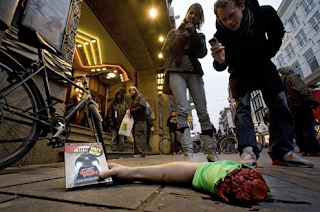
An entertaining tactic to advertise the release of horror movie "Dead Proof". I hope it was placed after the watershed.


A slightly degrading yet poignant and amusing message from German job agency jobsintown.de.


This is quite an impressive bus sticker advertising Copenhagen Zoo in Denmark surprisingly enough. It looks more like an extravagant Americanism.


National Geographic also produced an entertaining bus side ad, onlookers can watch passengers as they're swallowed by this animated shark.


It's amusing but really? A tactile piece of advertising or a lucky piece of vandalism?


The concept behind the "Holiday present" campaign is good and situated on the right street would work well, but despite the fact it's an installation to be removed do Cooper really want their image associated with litter and wastefulness when the motor industry are already so scrutinized in today's economical and environmental condition.

FEEL GOOD


The "feel good drinks co." is a fairly self explanatory name for the company, their aim being to spread a sense of "feel goodness" through their 100% natural sugar free drinks and the way they promote them.

Upon entering the site you are immediately met with a real sense of their ethos, this is helped by the use of 2.5D illustration/animation style giving you the impression of a brighter more innocent world and flipping from page to page more enjoyable than most sites.

Although I say wouldn't "feel good" have applied a clean design to their site it's still very visually appealing and easy enough to navigate. "Feel good" have also found an effective way to manage the text to image ratio across the site by setting the text on sign-post mainly situated at the front of the images and that load separately once most of the image has arrived so as to make them more noticeable.


This method is entertaining and keeps you engaged at first but if you're as impatient as most the loading time of the pages has the possibility of becoming a little tedious. This said I would rather take a few extra seconds of the "feel good" world over the fast loading pages of "innocent smoothies" with their nauseating jumping text.

Overall you have to agree that "feel good,” convey their message well through the site projecting a more innocent image than "innocent".


Wednesday, 25 August 2010

BLU


BLU is an Italian street artist that does no less than impress! Working all over the world he uses masonry paint and extended rollers to create massive character depictions across building faces; sometime funny, sarcastic or just obscure but always without fail intriguing. Moving away from traditional graffiti media BLU has managed to expand his art in ways that spray paint couldn't.


Since the beginning of his career he has been a keen collaborator working with such artist as Sweza and Ericailcane at the beginning of the century in anonymous artistic attacks on the streets of Bologna, Italy. BLU's style and popularity grew and by 2005 he was beginning to embark on a global journey of commissions.


As well as gigantic building statements he also had an early interest in digital media, more specifically stop frame animation. This combined with his versatile use of paint has enabled BLU to create some spectacular stop frame animation that really is not to be missed.


If you enjoyed that you can catch much more on You Tube. For drawings and other great works visit BLU's site.


As well as the obvious enjoyable element to this work there is often also a point, be it political or on elements of society. One piece that any 9-5 avoider would appreciate is the Berlin mural of late 2008. This gigantic image of a mind/headless office worker trying to keep tidy but yet chained down by not only time but also his gold and apparent greed. This image on a commuter’s route of the people it's supposed to represent could be taken as an insult, or maybe someone's sympathetic observation on the masses.