Showing posts with label Adverts/Designs. Show all posts

Thursday, 26 August 2010

SOME OF 40

The release of the 40 the most interesting and creative ambient ad campaigns is a treat and really worth a look! These are just a few of my favorites.


Maxwell House produced a floor cover for elevators situated inside office buildings to promote their "Wake Up " campaign. This would defiantly give any early morning sleep commuters a jolt.


This ad campaign for Feed SA screams at your conscience not only with the image but with its cleaver placement. The imploring child is a pull at the heart strings and looking down at them as you purchase you're unnecessary items should flood you with guilt... Until you conceal it with the first isle of shopping.


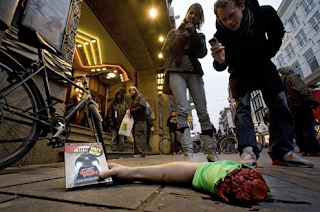
An entertaining tactic to advertise the release of horror movie "Dead Proof". I hope it was placed after the watershed.


A slightly degrading yet poignant and amusing message from German job agency jobsintown.de.


This is quite an impressive bus sticker advertising Copenhagen Zoo in Denmark surprisingly enough. It looks more like an extravagant Americanism.


National Geographic also produced an entertaining bus side ad, onlookers can watch passengers as they're swallowed by this animated shark.


It's amusing but really? A tactile piece of advertising or a lucky piece of vandalism?


The concept behind the "Holiday present" campaign is good and situated on the right street would work well, but despite the fact it's an installation to be removed do Cooper really want their image associated with litter and wastefulness when the motor industry are already so scrutinized in today's economical and environmental condition.

Tuesday, 24 August 2010

WE LOVE APPLE?

Adobe produced a two-piece webpage banner ad earlier this year in response to Apple's position on the heated dispute of Flash and it's compatibility with mobile "i"media.

Now whether you believe this is a pure power struggle or a war on freedom of expression, or indeed both you can't argue that it has been a bold display of strategy that left creative’s everywhere on the edge of their seats.


This advert (below) was a direct dig at Apple for refusing to apply Flash to the iPhone and other gadgets. The first web-banner appears with Adobe's logo leading with the statement "WE [heart] APPLE" followed by he second banner which reads "what we don't love is anybody taking away your freedom to choose what you create, how you create it and what you experience on the web".


This little 300x250 pixel ad, plain and with a basic colour scheme couldn't have more bells and whistles! The statement carried all the weight needed to grab people’s attention; relating to the key theme freedom of expression it was a direct swing at Apple over their control in the market.

Clicking on the second banner you are taken to an open letter written by Adobe (below) on the issue. Apple has also responded with an open letter of there own here.

This advert is a good example of having a strong message to put forward and executing it effectively; an obvious case of less is more.